This project was my second semester project in Medical Physics and follows on from what I learned in the first semester project. This semester, we worked with clinical scientists in Audiology who had requested from Medical Physics a way to treat patients inside virtual reality. This page will explore some of the work that was done in the project, and what I took away from it.
Working with clinical scientists was nice, as it allowed a project to be crafted which will hopefully help to treat patients. We get to specialize in our own areas and focus on our own tasks. One of my tasks as a Medical Physicist and programmer was to craft a virtual environment to facilitate this treatment. The task in particular was to create a relaxing beach with flying birds and rain as the main visual stimuli. My first task was to gain a basic understanding of what visual vertigo is, such that I could better understand the job of the clinician.
What is Visual Vertigo?
Visual Vertigo is defined as "dizziness provoked by full field repetitive or moving visual environments of visual patterns” according to Jean Marie Berliner. It is a chronic condition of what in simple terms can be called motion sickness, however this is experienced even when not moving. This is treated in many ways, and the way the clinicians wanted to treat it in this project was by having the patient look at objects in the environment under instruction from the clinician at time of use. The environment needed to be built up in stages, starting from an environment with no movement in it, up to an environment with a lot of movement. We refer to these stages as grades.
The Beach Environment
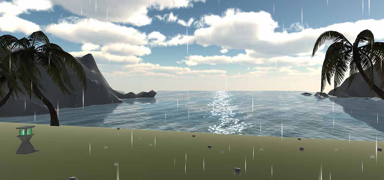
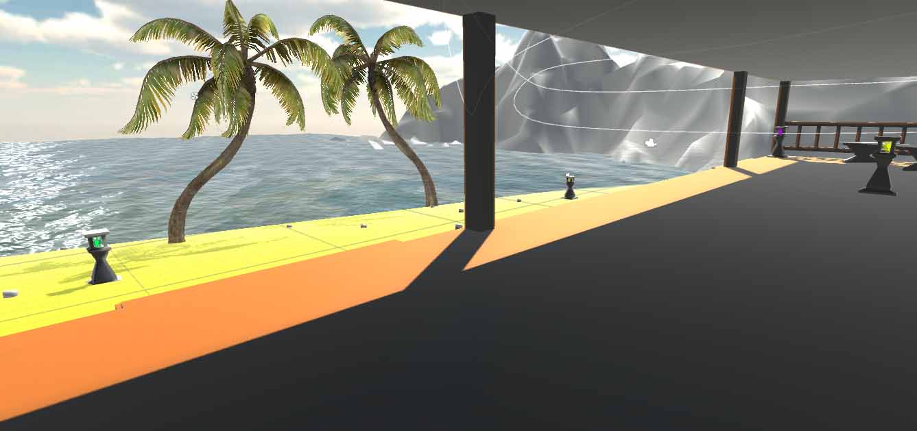
The environment went through many different prototypes and was subject to much testing. In the end, this was created. The purpose of the environments was to take a step up with how visually stimulating the environment was with each successive grade. Grade zero has no movement at all, and in higher grades the trees sway in the wind, bids fly through the sky, along with the introduction of some other effects.
Taking Treatment Further - A Quantitative Analysis
As well as creating the environment for the clinicians, something my supervisor suggested was to try to collect data from the Rift whilst it's in use. The Rift DK2 has a tracking system that works accurately in both rotation and position, and this is how a user is able to move in VR; so I devised a method for automatically collecting this data in hope that it may be useful in treatment. I think it is quite reasonable to expect that the way a dizzy person moves could correllate with the severity of their condition. If patterns are found, this could help early diagnosis and improve methods of quantifying patient progress over time with their treatment.
If you're going to collect data, you need to know if the data is reliable. So the DK2 can track position and rotation, but how well? I already mentioned that it is accurate, but this was tested with some simple experiments, as briefly outlined below:
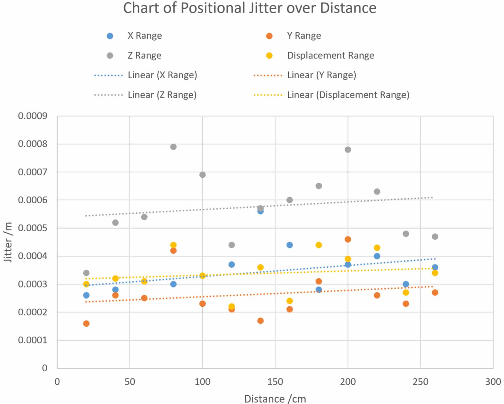
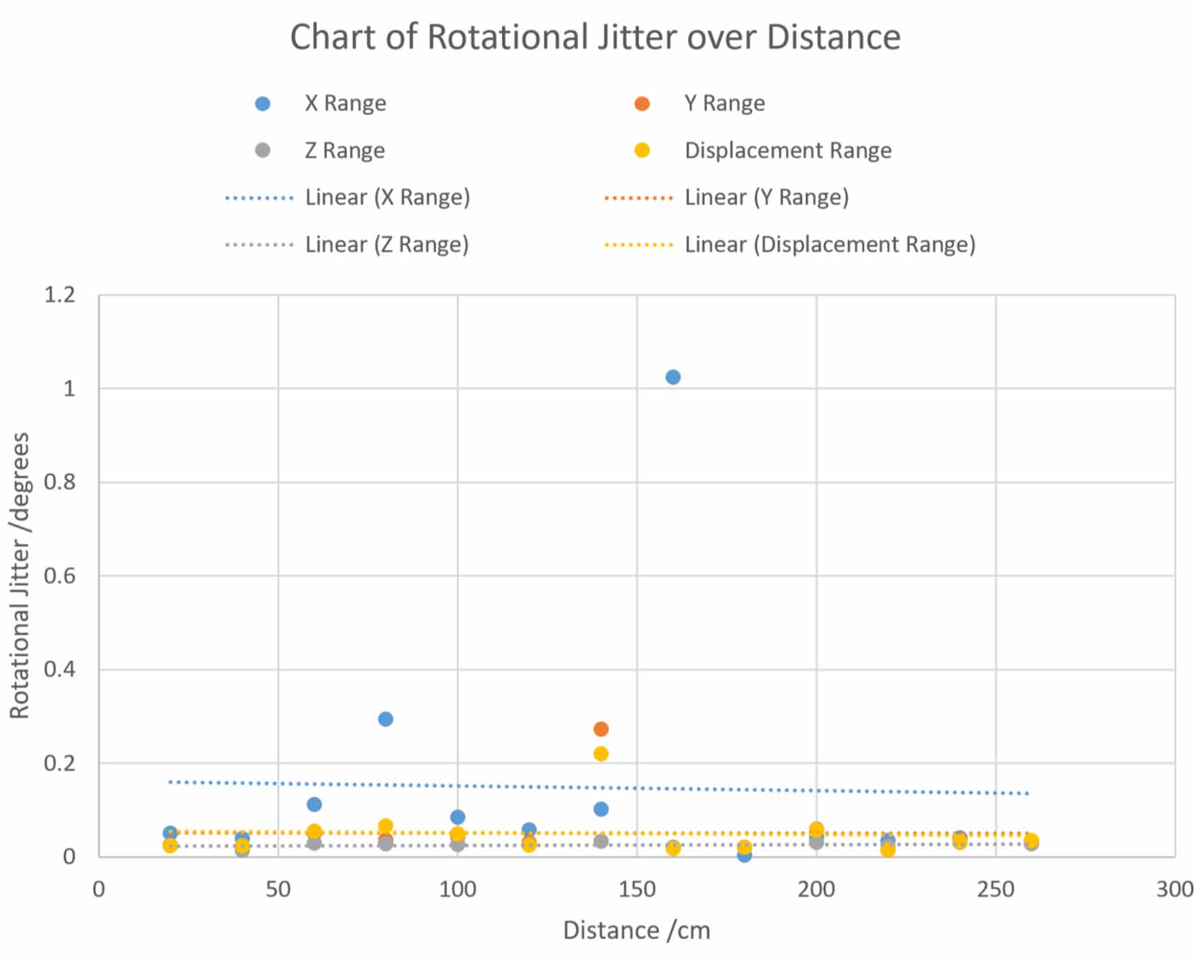
- Jitter Test - The headset was placed on foam at set distances from the tracking camera, ranging from 20 to 260cm. The jitter in the tracking was monitored at each distance, showing how much the DK2 thinks it is moving when it is in fact stationary.
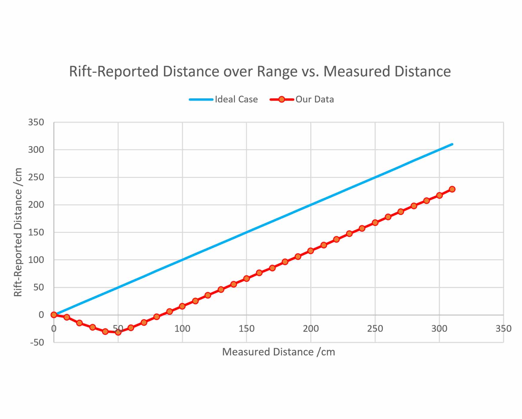
- Distance Test - Similarly to the jitter test, the headset is moved away from the tracking camera in steps. This time, instead of monitoring jitter, we instead monitored how far the DK2 thought it had moved and compared that with what was measured using a tape measure.
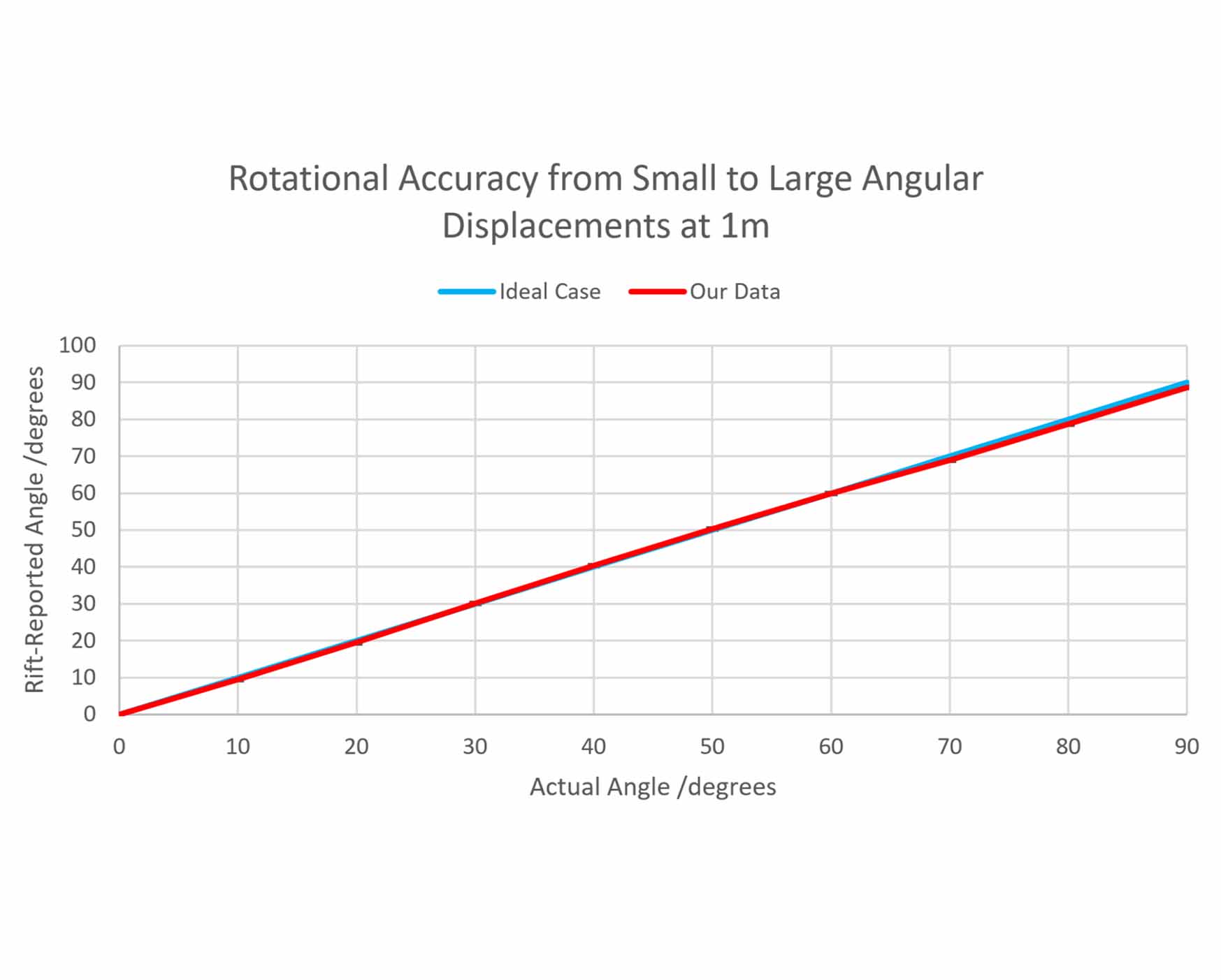
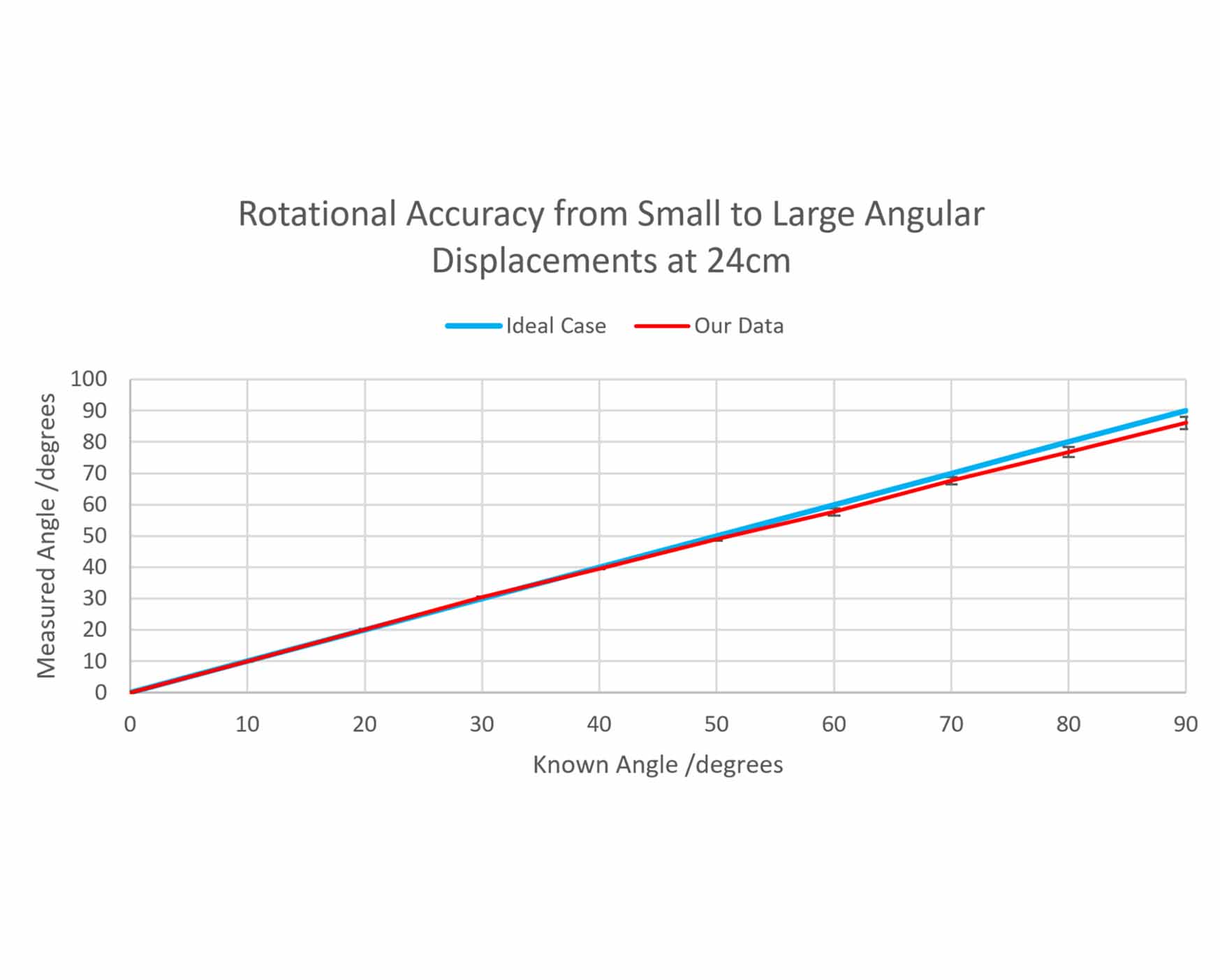
- Rotation Test - The headset was placed onto graph paper with angles marked out in 10° increments. The headset was rotated through these increments with a vertical laser strapped to it, so that we could see precisely how much it had rotated. This rotation was compared with how much the headset thought it had rotated. This test was performed at 24cm and 1m.
Results
Summarised Discussion
In the results for positional jitter, it makes sense that the z-axis jitter is much higher than that of the x and y axes. This is because the z-axis marks depth, and a single tracking camera setup, such as what the DK2 uses, should have more difficulty with this. As you may expect, the positional tracking degrades further from the camera. The positional jitter caps at 0.8mm and is insignificant. The results for rotational jitter are more consistent if we ignore the anomalies, and show stable rotational tracking over distance. This is because the internal sensors help to keep the rotational tracking sensible. The rotational jitter is also insignificant.
The graph titled "Rift-Reported Distance over Range vs. Measured Distance" shows the results for the distance test. The blue “Ideal Case” series is a straight line of gradient = 1, where moving the Rift 50cm in the real world results in the Rift reporting 50cm of movement. The red “Our Data” series shows what was actually found. The recorded data starts off by deviating from the ideal case, and by 50cm an almost-constant offset is found. In testing, poor performance was expected below 50cm, as the recommended operational range is 50cm to 250cm. What matters in this chart is not how far away the red line is, but how consistent the gradient is. As it is very consistent within the recommended operational range, the tracking is great.
For the rotation test results, it's immediately obvious that the tracking is much better at 1m than 24cm - this should make sense given the 50cm to 250cm operational range I mentioned in the previous paragraph. We knew about this and tested anyway because that's what we do as scientists. In both cases you can see that the tracking drops off a bit at larger angles, which makes sense given how the tracking works; which is by the camera detecting LEDs on the headset. As the headset rotates, less LEDs are visible, and so the tracking quality degrades. At 1m, it's an acceptable degredation.
Collecting data is one thing, but if I just give someone a text file with loads of numbers in it, I wouldn't expect anyone to be enthusiastic about trying to make sense of it. To try to counteract this, I developed an application that handles the data processing in meaningful ways.
The Processing Application
The purpose of this application is to take the data from the headset and make sense of it. We know the data is reliable, so we needed a way to provide fast analysis of the data in meaningful ways. I tasked myself with creating my first Windows application to fulfill this requirement.
The application does quite a few things. It does some conversions, it scales the charts properly, and tries to provide useful information to the user. Fundamentally, the application allows you to compare data from an old session with a patient with data from a newer session; and this shows how the data has changed over the course of their treatment. This data could be useful for many reasons, but we won't know for sure until the clinical trials.
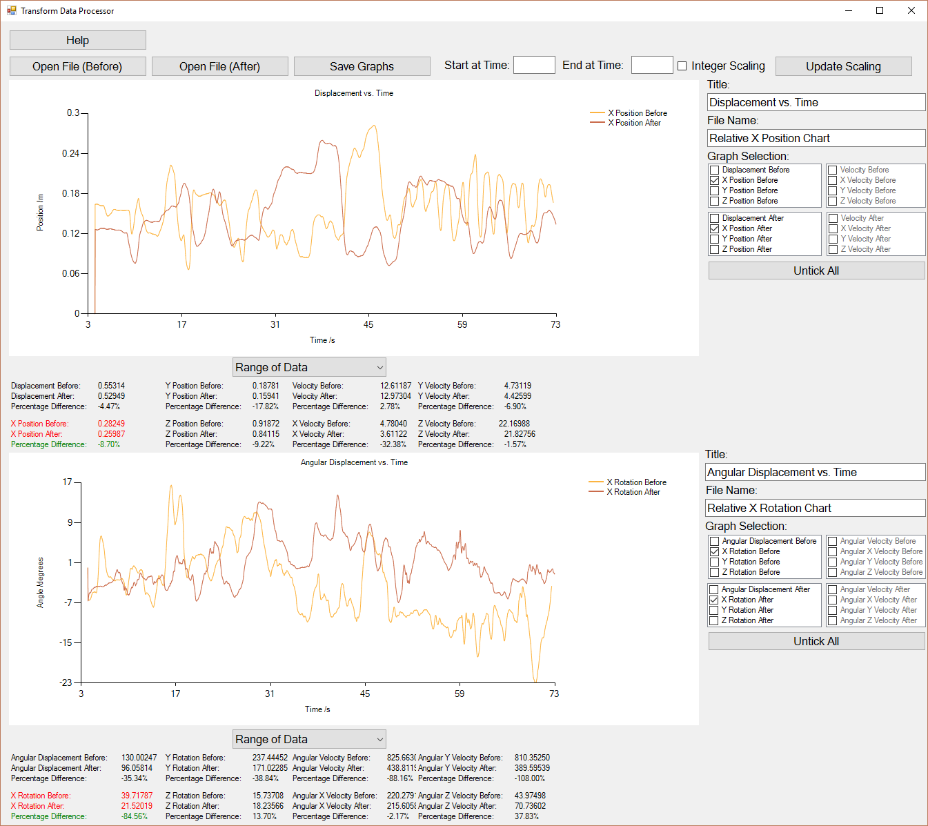
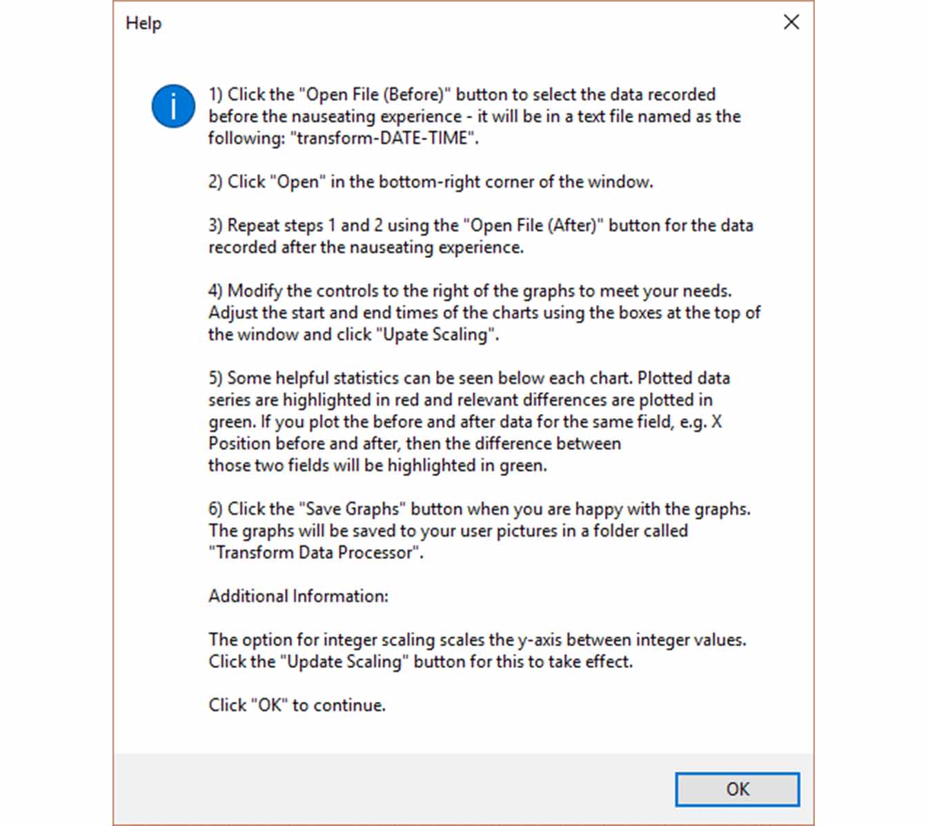
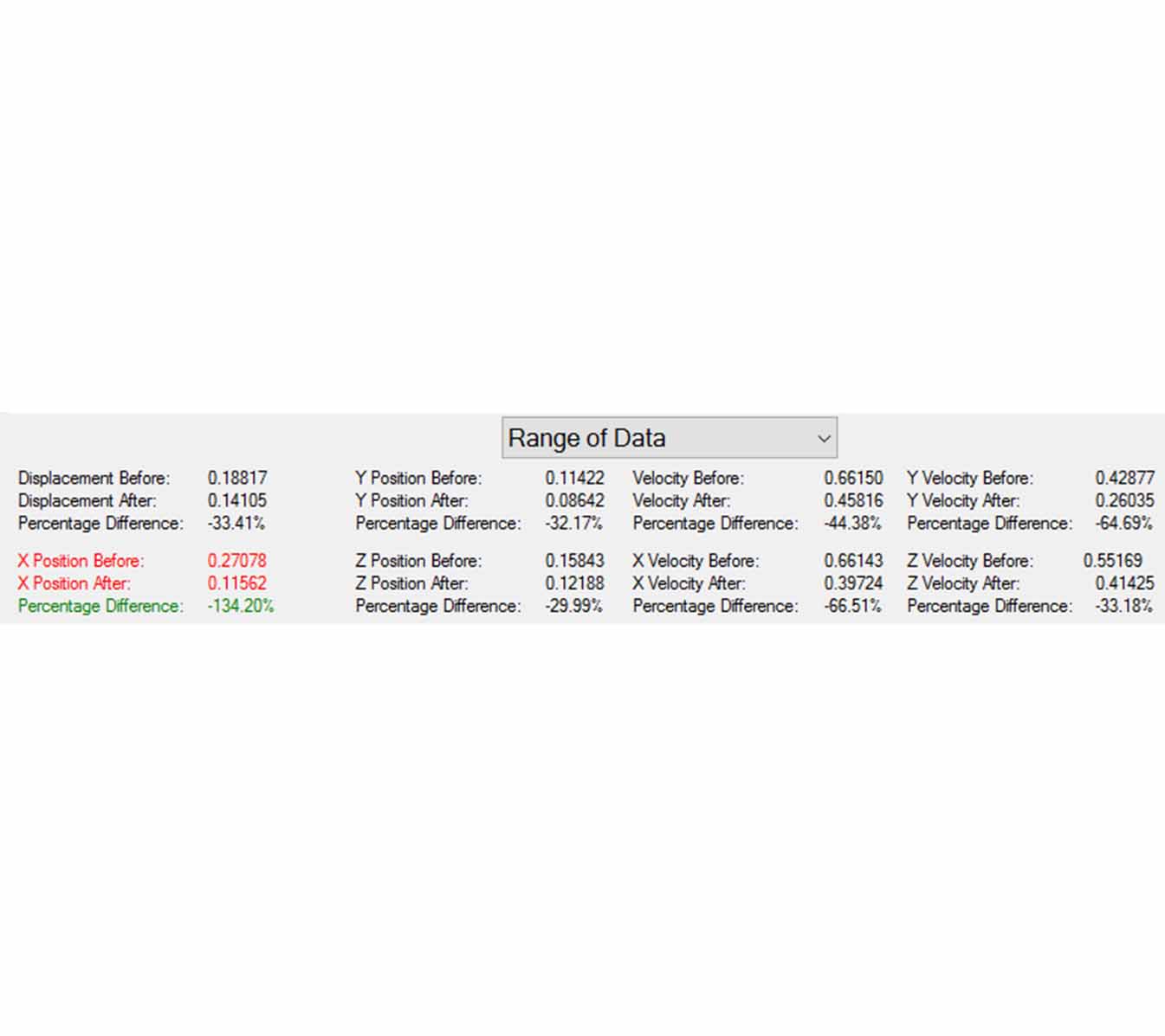
When you load the data, some charts are drawn and you can play around with the options. There is a chart for positional data, and another chart below for rotational data. Each chart has its own controls and statistics section, which shows the range of the data series by default; however it can also show the Standard Deviation and Average of the series. When plots are selected, their accompanying statistics are highlighted in red to draw attention to them. For example, in the image above showing the main application, you can see the the X Position Before and After are selected, and so X Position Before and After statistics are highlighted in red. Since two of the same series have been selected, their difference field, showing the difference in the data between the two sessions, is highlighted in green.
The data doesn't always start when time is zero. The clinician can start running the beach environment before the patient goes into it, and so the data will start recording before the test begins. In such a case, the data at the beginning is not relevant, and it must be cut off. Therefore, there are controls to select both the start and end time at the top of the application. Once suitable charts have been created, they can then be saved exactly as they are seen.
At the end of this project, I produced a 15,900 word report for assessment, as well as a lab book. I was also assessed with a Viva, or an interview.
Summary of learned or improved skills:
- Word
- Photoshop
- Visual Studio
- C#
- Windows Forms
- Unity
- 3DS MAX
- Maya
